If my tut is hard to understand, google it ok? (because my english isn't very good)
Before you start be sure that you had PS (im using CS2)
Some links that you are going to need later:
http://www.deviantart.com/ , this is a great place to get good PS brushes, Type brushes on the search OR go if you want something especial for backgrounds got to this:
HEREAnd fonts for your sig:
http://www.dafont.com/So, lets start First, open your PS
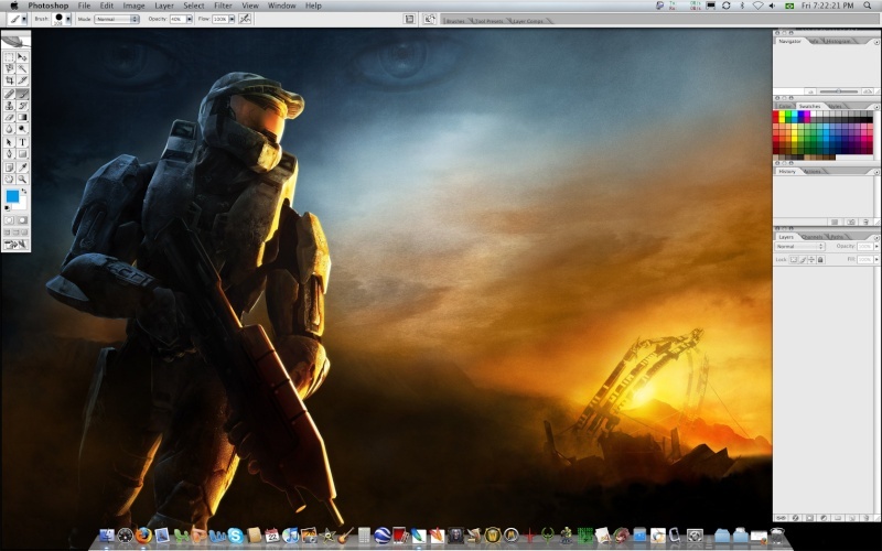
Then create a new image (400x125)
Now create a new layer and select the Rectangular marquee tool and select all the Layer 1 then click at Edit -> Stroke, so now select 1 px and Black color, now depending by your PS you had to select Inside or Outside.
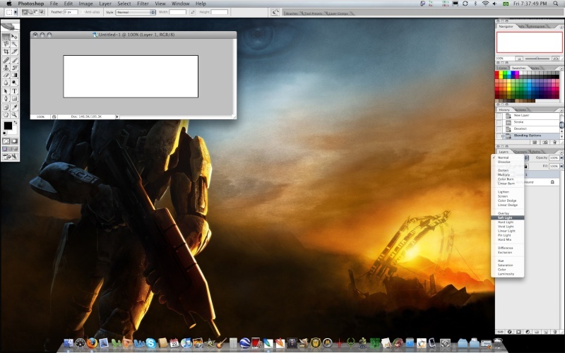
Select as Blend Mode as Soft light for the Layer 1
The line will looks like it hided but it isn't
Now lets make the paint part
this looks a pretty good, don't it?
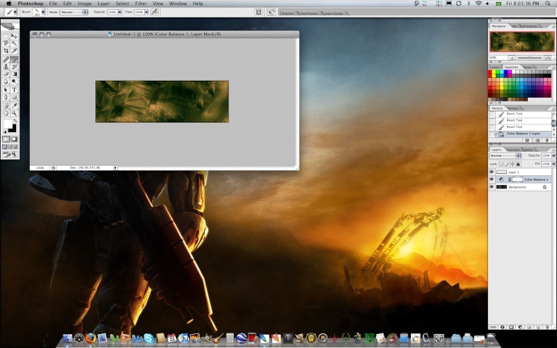
Lets make the true sig, click at Filters -> Render -> Clouds. This helps with lots of backgrounds, now goto the second link of Deviant Art that i gave to you and select one of the NQ Abstracts and download it and install. And brush a little the result will looks like this (NOTE: Paint click per click or your sig will be crappy) :

so now select Layers -> Adjustment Layers -> Color Balance. Mess around coloring your sig, when you finished it you should had something like that:
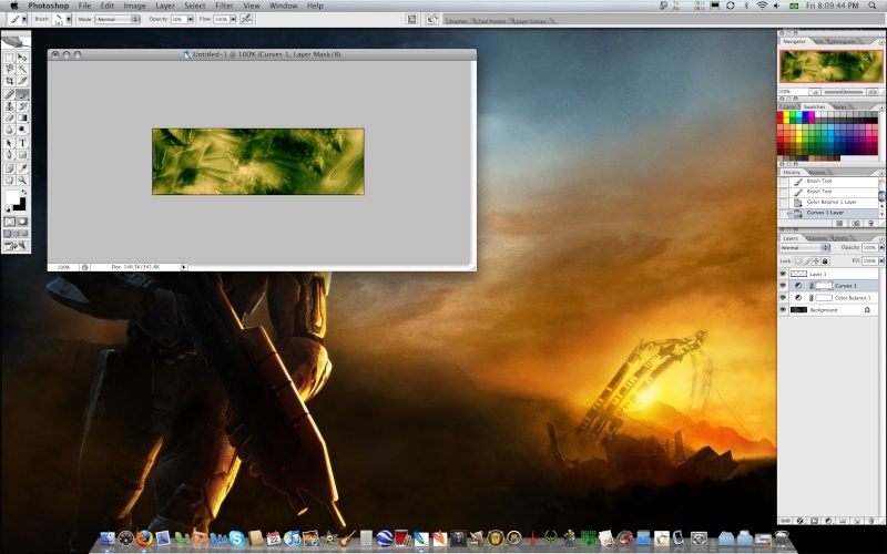
Now lets make it looks a lot better, go to Layers -> Adjustment Layers -> Curves. Now be careful doing this or it looks a lot crappy, so if you did it carefully and correctly it will looks like that:
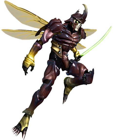
If it didn't good yet to you mess around with other effects, after you finished lets add a guy to render it (google it or get this that im going post) here's a guy:
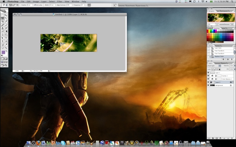
If you don't had time to lasso they simply duplicate the layer. So lets add it to our sig, after you moved your render to your sig you didn't need more the render window so close it. Add effects to it to combinate it with the background
Now its time to using
www.dafont.com , find around the site for a font that you think cool.
I'm going to use Blazed font

Nice eh?
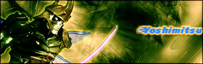
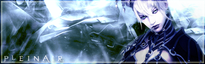
Final Result: